MRR Growth Analysis
21 May, 2018
In this we’ll analyze the components that make up MRR and find which segments are growing and shrinking the most quickly. We’ll gather all subscription MRR values from the past 90 days.
First thing’s first, let’s collect the data we need. We’ll grab the data from this Look.
# get mrr data
mrr <- get_look(4476)
Now that we have the data, we can do some light tidying
# rename columns
colnames(mrr) <- c('date', 'gateway', 'simplified_plan_id', 'billing_interval', 'mrr', 'subscriptions')

# set date as date
mrr$date <- as.Date(mrr$date, format = '%Y-%m-%d')

# replace billing intervals
mrr$billing_interval <- as.character(mrr$billing_interval)
mrr <- mrr %>%
  mutate(billing_interval = gsub('Annual', 'year', billing_interval)) %>%
  mutate(billing_interval = gsub('Monthly', 'month', billing_interval)) %>%
  mutate(billing_interval = gsub('Quarterly', 'year', billing_interval)) %>%
  mutate(billing_interval = gsub('Yearly', 'year', billing_interval))
Now we can do a bit of exploratory analysis.
Exploratory Plots
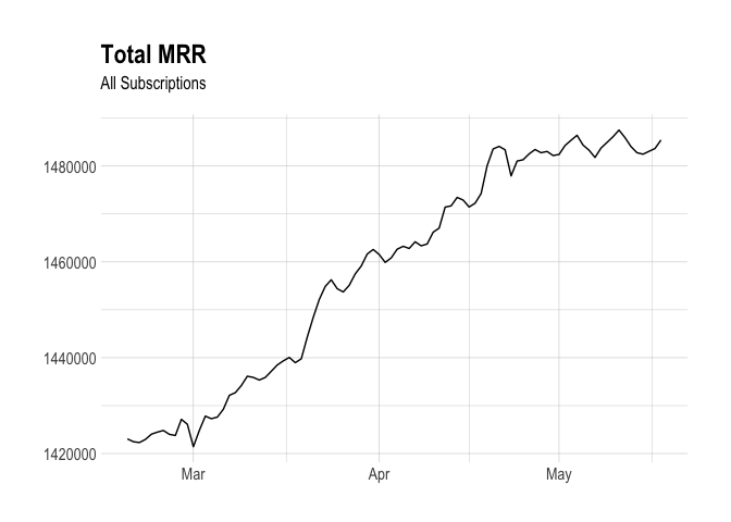
Let’s quickly plot total MRR over time to get a sense of how things have been going in the past few months.
Now let’s visualize MRR for each segment. Each segment will be defined as the combination of the simplified plan ID, the billing interval, and the gateway.
# define segments
mrr <- mrr %>%
  mutate(segment = paste(gateway, simplified_plan_id, billing_interval, sep = "_"))

This is a useful plot to see. We can easily identify the segments of MRR that are growing well and others that are struggling a bit. We can do better by fitting a model to this data and sorting the segments by how quickly or slowly they have been growing.
Modeling Growth Coefficients
Now let’s fit linear models to the segments so that we can get growth coefficients for each.
# get the year
by_segment <- mrr %>%
  filter(gateway != 'Manual') %>%
  group_by(date, segment) %>%
  summarise(total_mrr = sum(mrr, na.rm = TRUE)) %>%
  mutate(year = year(date) + yday(date) / 365) %>%
  ungroup()

# create logistic regression model
mod <- ~ lm(total_mrr ~ year, .)

# calculate growth rates for each user (this might take a while)
slopes <- by_segment %>%
  nest(-segment) %>%
  mutate(model = map(data, mod)) %>%
  unnest(map(model, tidy)) %>%
  filter(term == "year") %>%
  arrange(desc(estimate))
Great, now we can plot the MRR values by segment, ordering them by the growth coefficients.
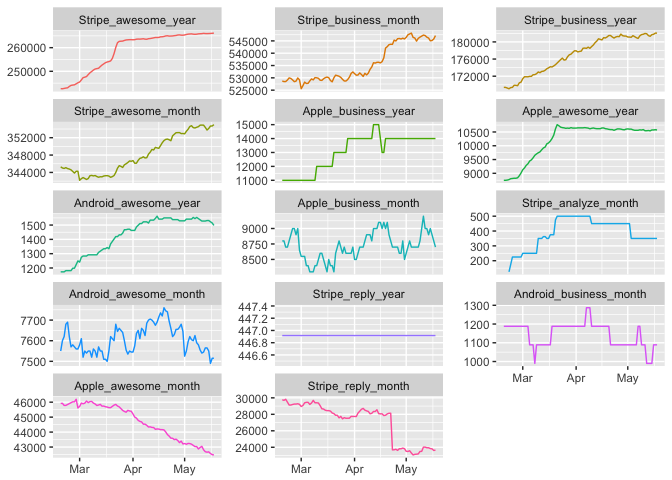
These charts depict total MRR by segment and are ordered by quickest to slowest growth. We can see that MRR from annual Awesome/Pro plans are growing the most quickly, followed by monthly and annual Business MRR coming from Stripe.
Unfortunately, Reply MRR has contracted a bit, and monthly Awesome/Pro MRR from Apple has declined quite a bit. MRR from Android has remained roughly constant.
Looking Ahead
I would love to hear about how useful this type of analysis is. If it does seem useful, I will build a Shiny app so that anyone can run this analysis at any time. Thanks!