NPS Scores and Churn
16 July, 2018
In this analysis we examine the relationship between NPS scores and customer churn. We gather NPS survey responses from the past year and compare the churn rates of those users that completed the surveys.
In this analysis we find that there does seem to be a relationship between NPS scores and churn rates. The standard NPS segments - Detractors, Passives, and Promoters - don’t capture this relationship perfectly, but they come close. Users that gave a score of 0 have the highest churn rates. Those that gave a score of 1 through 6 have similar churn rates, and users that gave a score of 7 through 10 have the lowest churn rates.
Data Collection
We’ll query Redshift for both datasets, then join them together in R. We will only gather Awesome and Business NPS survey responses. For simplicity’s sake we’ll only use users’ most recent NPS survey resposnes.
select
  id
  , user_id
  , date(created_at) as created_at
  , score
  , survey_type
  , segment
from dbt.nps_responses
where created_at >= (current_date - 365)
and survey_type = 'awesome' or survey_type = 'business'
and is_latest_nps_score
Now let’s gather the subscription churn data. We will gather the data on the last day of each month and calculate the proportion of users that churned in the 30 days prior.
select
  s.id
  , u.id as user_id
  , date(s.date) as date
  , s.customer_id
  , s.subscription_id
  , s.days_since_last_active_status
  , case when s.days_since_last_active_status < 31 then True else False end as active_30_day_window
  , case
      when s.days_since_last_active_status < 31 and s.days_since_last_active_status > 0 then True
      else False
    end as churned_30_day_window
from subscription_activity as s
join dbt.users as u
  on u.billing_stripe_customer_id = s.customer_id
where s.date >= (current_date - 365)
and (extract(day from date(s.date) + 1 )::integer) = 1 -- last day of the month
group by 1,2,3,4,5,6,7,8
Now we need to join the datasets together.
# join churn and nps data
user_churn <- churn %>%
  left_join(select(nps, -id), by = "user_id")
Great, now we’re ready to make some graphs!
Exploratory Analysis
Let’s first look at the proportion of users that churned in the 30-day window each month.
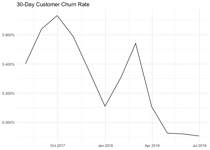
Great, it looks like there is a decreasing trend overall. Now let’s segment this data by NPS segments.
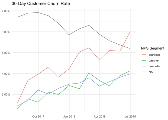
This is an interesting graph. We can see that detractors do in fact have the highest churn rates of those that filled out an NPS survey. Interestingly, those that had not filled out a survey churned at a higher rate historically. This may be due to our sampling – we may have only showed the NPS survey to customers that had been on a paid plan for at least 30 days. This difference might also be attributed to the theory that users that filled out the survey were more invested in the product than those that didn’t.
We can also observe that the churn rates of those that have filled out the survey have increased over time, whereas the churn rate of those that didn’t fill out the survey has decreased. I’m not completely sure why this is, but it may be due to the fact that we started showing the survey to a higher percentage of customers. It may also be due to the fact that we show the survey to the same customers multiple times, but I’m not sure.
Another interesting observation is that the churn rates don’t differ for passives and promoters – only detractors differ significantly.
Let’s break this down further and look at churn rates for each specific sore.
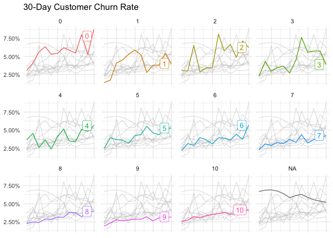
This is also an interesting graph! We can see right away that the churn rates for users that responded with 7, 8, 9, or 10 don’t differ that much. In fact, it looks like the churn rate of those users that respond with 10 might be slightly higher than that of those users that responded with 9!
The churn rate of users that gave Buffer a score of 0 is the highest of all, which makes sense. However, the churn rates of users that gave scores of 1 through 6 are not all that different!
Let’s look at the most recent churn rates for users that gave each score.
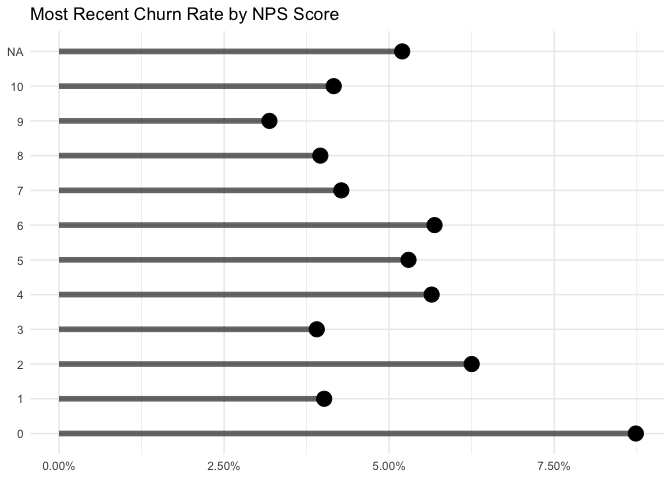
This chart summarizes our conclusions from the previous chart well. We can see that users that gave a score of 0 have the highest churn rates. Those that gave a score of 1 through 6 have similar churn rates, and users that gave a score of 7 through 10 have the lowest churn rates.
Conclusions
Overall, there does seem to be a relationship between NPS scores and churn rates. The standard NPS segments - Detractors, Passives, and Promoters - don’t capture this relationship perfectly, but they come close. Users that gave a score of 0 have the highest churn rates. Those that gave a score of 1 through 6 have similar churn rates, and users that gave a score of 7 through 10 have the lowest churn rates.