How Did The Awesome Price Change Affect Upgrades?
20 March, 2018
TL;DR
- The price change announcement lead to a ~40% increase in weekly Awesome upgrades.
- The total cumulative effect of the announcement is around 1500 extra Awesome upgrades.
- The probability of a true causal effect is greater than 99.9%.
- The effect declines over time, as most users have decided to accept or decline the offer.
Context
On February 22, we let Buffer users know that we would be making changes to the Awesome plan, renaming it “Pro” and increasing the monthly price from $10 to $15. We encouraged users to lock in the lower price by subscribing to the annual Awesome subscription for $102 or renewing their existing annual subscription.
Almost a month has passed since this communication. The purpose of this analysis is to determine if there was any singificant impact on the number of people that upgraded to the Awesome plan from the Free plan. To determine this, we’ll employ we’ll use a method of inference developed by Google engineers called causal impact.
A controlled experiment is the gold standard for estimating effect sizes, but we don’t have that here – we effectively put everyone in the experiment group. Sometimes that is necessary, and it’s ok! We can still measure effect sizes, effectively. ;)
The idea is this: given a time series, say weekly upgrades, and a set of control time series, say weekly active users or weekly trial starts, we constructs a Bayesian structural time-series model. This model is then used to try and predict the counterfactual, i.e. how the response metric (upgrades) would have evolved after the intervention if the intervention had never occurred. Essentially, we take the data before the event and forecast it to the current date, and compare the forecast with what occurred in actuality.
The model assumes that the time series of the treated unit can be explained in terms of a set of covariates which were themselves not affected by the intervention. In this case, we should be able to use active users and trial starts as covariates.
Data Collection
Before we begin, we must collect data on user upgrades. When a user upgrades from Free to Awesome, we make an important assumption that a new subscription is created. This is important, because it means that we are not measuring the impact that the communication had on subscription renewals.
So we’ll gather all of the Awesome subscriptions created in the past few months. We only include subscriptions that have been successfully paid for.
select
  s.id as subscription_id
  , s.customer as customer_id
  , u.user_id
  , date(u.created_at) as signup_date
  , date(s.start) as start_date
  , date(date_trunc('week', s.start)) as start_week
  , date(s.canceled_at) as end_date
  , s.plan_id
  , count(distinct c.id) as successful_charges
from stripe._subscriptions as s
inner join dbt.users as u on s.customer = u.billing_stripe_id
inner join stripe._invoices as i on i.subscription_id = s.id and s.plan_id = i.subscription_plan_id
inner join stripe._charges as c on c.invoice = i.id and c.captured and c.refunded = false
where s.plan_id in ('pro-monthly', 'pro-annual')
and s.start >= '2017-08-01'
group by 1, 2, 3, 4, 5, 6, 7, 8
Great, we have over 30 thousand Awesome subscriptions to work with. Next we use the following query to get Awesome trial starts.
select
  s.id as subscription_id
  , date(s.trial_start_at) as trial_start_date
  , date(date_trunc('week', s.trial_start_at)) as trial_start_week
  , plan_id
from dbt.stripe_trials as s
where s.plan_id in ('pro-monthly', 'pro-annual')
and s.trial_start_at >= '2017-08-01'
group by 1, 2, 3, 4
And finally we’ll get our weekly active user counts.
select
  date(date_trunc('week', created_at)) as update_week
  , count(distinct user_id) as users
from dbt.updates
where created_at >= '2017-08-01'
  and was_sent_with_buffer
  and status != 'failed'
  and client_id in (
        '5022676c169f37db0e00001c', -- API and Extension
        '4e9680c0512f7ed322000000', -- iOS App
        '4e9680b8512f7e6b22000000', -- Android App
        '5022676c169f37db0e00001c', -- Feeds
        '5022676c169f37db0e00001c', -- Power Scheduler
        '539e533c856c49c654ed5e47', -- Buffer for Mac
        '5305d8f7e4c1560b50000008'  -- Buffer Wordpress Plugin
      )
group by 1
Awesome, now we can do a bit of transformation and merge the data into a single dataframe.
# get weekly subscription starts
weekly_subs <- users %>%
  group_by(start_week) %>%
  summarise(subscriptions = n_distinct(subscription_id))

# get weekly trial starts
weekly_trials <- trials %>%
  group_by(trial_start_week) %>%
  summarise(trials = n_distinct(subscription_id))

# join all together
data <- weekly_subs %>%
  inner_join(weekly_trials, by = c("start_week" = "trial_start_week")) %>%
  inner_join(weekly_users, by = c("start_week" = "update_week")) %>%
  mutate(users = as.integer(users))

# glimpse data
glimpse(data)
Alright, we’re ready for a bit of exploratory analysis.
Exploratory Analysis
Ideally, we want subscriptions, trials, and weekly active users to all be correlated. Let’s plot the three metrics and see if this is true.
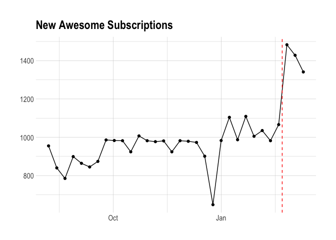
The plot below shows the number of new awesome subscriptions created each week. We can see a huge spike during the week in which we let users know about the price increase. That’s neat.
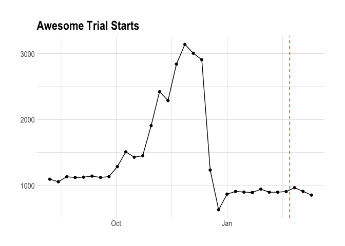
We should now look at the number of trials each week. This plot is interesting in its own right – I believe we used to encourage Awesome trials much more than we do now. What’s clear is that Awesome trial starts do not correlate with the number of new Awesome subscriptions.
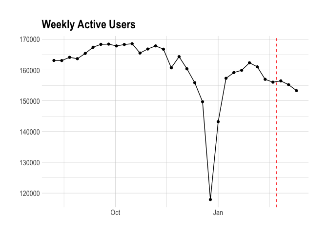
Finally, we’ll look at weekly active users. There isn’t much to get into – it’s clear that it doesn’t correlate well with the number of new subscriptions created.
Even though trial starts and weekly active users won’t act at reliable predictors of Awesome upgrades, we can use the date as the predictor and be fine.
Causal Impact
We defined the post-intervention period to be from February 19, the first week that includes the date we made the announcement (Feb 22), to March 12, the last full week of data that we have. The pre-intervention period, weeks August 7 to February 12, is used to forecast what Awesome upgrades would have looked like without the change. In this case, a simple average of 946 upgrades per week is used. Easy.
To perform inference, we run the analysis using the CausalImpact command.
# run analysis
impact <- CausalImpact(subs_ts, pre.period, post.period, model.args = list(niter = 5000))

# plot impact
plot(impact) +
  labs(title = "Impact on Awesome Upgrades")
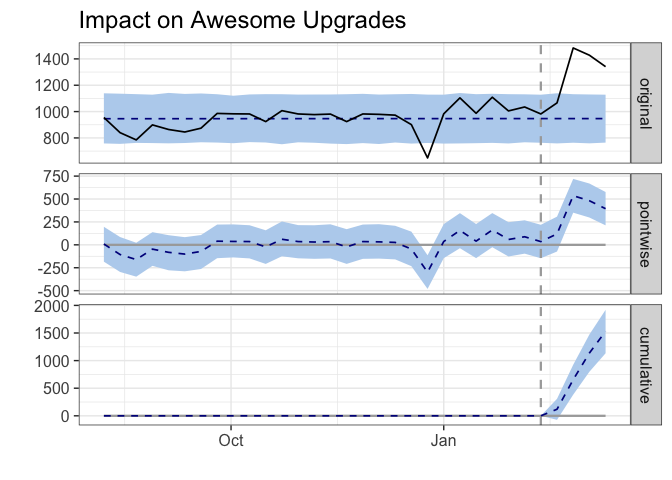
The resulting plot is quite interesting. The top panel in the graph shows the counterfactual as a dotted line and blue confidence interval – this is the estimate of what upgrades would have been without an intervention. The solid black line shows the number of Awesome upgrades that actually occurred.
The middle panel shows the point estimate of the effect of the intervention each week. We can see that the point estimate of the effect is around 250-500 extra upgrades each week. This is naturally declining.
The bottom panel visualizes the cumulative effect that the intervention had on Awesome upgrades. As of last week, the cumulative effect is around 1500 extra upgrades. Wow!
How can we determine if this effect is statistically significant? That is the core question, since we don’t have a controlled experiment here.
# get summary
summary(impact)
## Posterior inference {CausalImpact}
##
##                          Average       Cumulative
## Actual                   1330          5318
## Prediction (s.d.)        947 (49)      3787 (198)
## 95% CI                   [850, 1046]   [3399, 4185]
##
## Absolute effect (s.d.)   383 (49)      1531 (198)
## 95% CI                   [283, 480]    [1133, 1919]
##
## Relative effect (s.d.)   40% (5.2%)    40% (5.2%)
## 95% CI                   [30%, 51%]    [30%, 51%]
##
## Posterior tail-area probability p:   2e-04
## Posterior prob. of a causal effect:  99.98%
##
## For more details, type: summary(impact, "report")
This summary tells us that we’ve seen an average of 1330 awesome upgrades per week since we made the announcement about the price change. The predicted average, based on previous weeks, would have been 947 The relative effect was a 40% increase in awesome upgrades– the 95% confidence interval for this effect size is [30%, 51%]. That’s a big effect!
The probability of a true causal effect is very high (99.98%), which makes sense given what we saw in the graphs. Cool!