Analysis of Pro Plans
In this analysis we’ll explore the Pro plans we introduced in March. It has now been a couple months since we’ve introduced the new plans, so we can make comparisons with the Awesome plans with a certain degree of confidence.
We’ll look at the amount that MRR from the monthly and annual Pro plans has grown and compare that to the same value from the Awesome plans over a different period of time. Then we’ll examine the churn rates of each plan.
These are the key findings of this exploration:
- The introduction of the Pro plans led to a large positive impact on Awesome/Pro MRR.
- Pro MRR is still growing very quickly, more quickly than any other plan.
- Pro subscriptions are churning at a significantly higher rate than Awesome subscriptions thus far.
Data Collection
Let’s begin by comparing MRR growth for each plan. We’ll gather the data we need from the subscription_mrr_values table in Redshift.
select
  date
  , date(date_trunc('week', date)) as week
  , plan_id
  , simplified_plan_id
  , plan_billing_cycle as billing_interval
  , count(distinct subscription_id) as subscriptions
  , sum(mrr_amount) as mrr
from dbt.subscription_mrr_values
where date >= (current_date - 365)
group by 1, 2, 3, 4, 5
Comparing MRR
Great, now we can view how MRR has grown for each plan type. The new Pro plans have the IDs pro_v1_monthly and pro_v1_yearly, while the old Awesome plans have the IDs pro-monthly and pro-annual. A little confusing, but we can work with it. :)
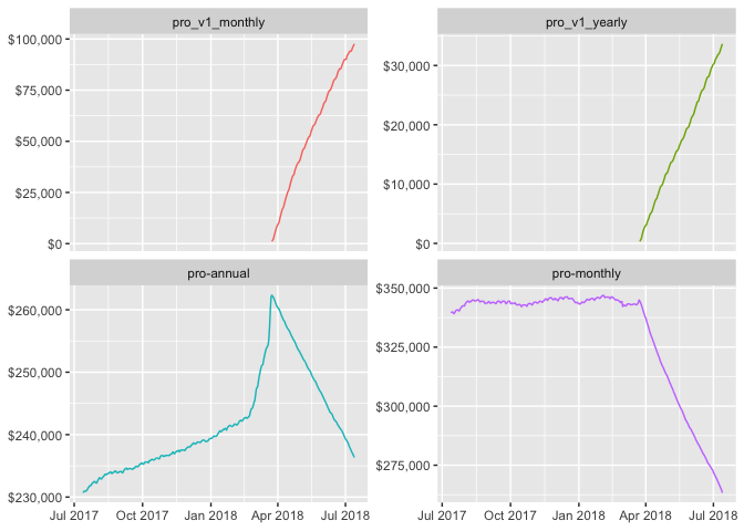
We can see the sharp decline in MRR for the old Awesome plans whenever we introduced the new Pro plans. Let’s see how total MRR has grown over time for the Awesome/Pro plans
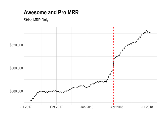
The red dashed line represents the date at which we introduced the new Pro plans. We can clearly see the positive impact that the change has had on total MRR. Now let’s take a look at MRR from the new Pro plans exclusively.
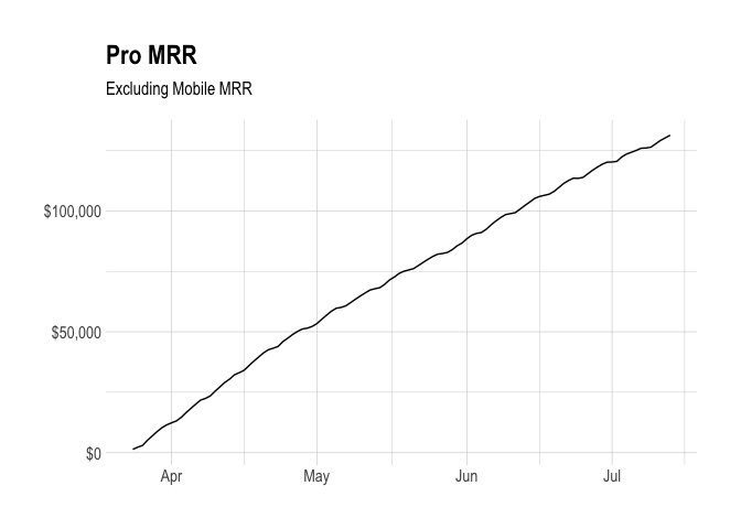
We can see that MRR has grown very quickly in the past few months. Let’s look at weekly growth for the pro plans and compare that to other plans.
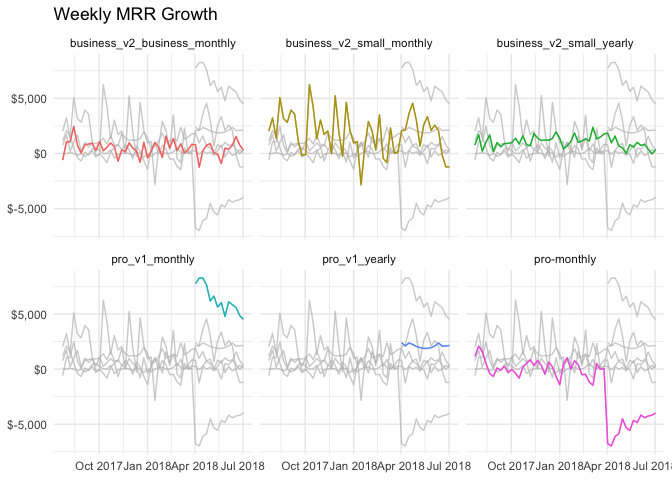
From this graph we can see clearly that the monthly Pro plan has been the highest growing of all the plans by some distance.
Let’s now compare churn rates of the Pro and Awesome plans.
Comparing Churn Rates
Now let’s try to compare the churn rates of the Pro plans to that of the Awesome plans. To do this, we’ll need to use a technique called Survival Analysis. Clasically, survival analysis was used to model the time it takes for people to die of a disease. However it can be used to model and analyze the time it takes for a specific event to occur, churn in this case.
It’s particularly useful in this case because of missing data – there must be subscriptions that will churn in our dataset that haven’t yet. This is called censoring, and in particular right censoring.
Right censoring occurs when the date of the event is unknown, but is after some known date. Survival analysis can account for this kind of censoring. There is also left censoring, for example when the date the subscription begain is unknown, but that is less applicable to our case.
The survival function, or survival curve, (S) models the probability that the time of the event (T) is greater than some specified time (t) and is composed of:
-
The underlying Hazard function (how the risk of churn per unit time changes over time at baseline covariates).
-
The effect parameters (how the hazard varies in response to the covariates).
Let’s try it out! First we’ll need to gather our Awesome and Pro subscriptions.
select
  s.id
  , date(s.created_at) as created_at
  , date(s.canceled_at) as ended_at
  , s.plan_id
  , s.simplified_plan_id
  , s.billing_interval
  , s.successful_charges
from dbt.stripe_subscriptions as s
inner join dbt.stripe_invoices as i
  on s.id = i.subscription_id
  and i.paid
  and i.amount_due > 0
where i.subscription_plan_id in ('pro-monthly', 'pro-annual', 'pro_v1_monthly', 'pro_v1_yearly')
and s.plan_id in ('pro-monthly', 'pro-annual', 'pro_v1_monthly', 'pro_v1_yearly')
and s.successful_charges >= 1
and s.created_at >= (current_date - 365)
We need to create an indicator to let us know if the subscription churned. We also need to count the number of days it took to churn.
# calculate subscription length
pro_subs <- pro_subs %>%
  mutate(churned = !(is.na(ended_at)),
         length = ifelse(churned, as.numeric(ended_at - created_at), as.numeric(Sys.Date() - created_at)),
         censored = ifelse(churned, 0, 1),
         plan_type = ifelse((plan_id == 'pro-monthly' | plan_id == 'pro-annual'), 'awesome',
                            ifelse(plan_id == 'pro_v1_monthly' | plan_id == 'pro_v1_yearly', 'pro', 'other')))
Now we can create a survival object. That is basically a compiled version of the length and censored columns that can be interpreted by the survfit function. A + behind survival times indicates censored data points.
# fit survival data using the Kaplan-Meier method
surv_object <- Surv(time = pro_subs$length, event = pro_subs$churned)
head(surv_object)
## [1] 122 126+ 196 291+ 357+ 235+
Awesome! The next step is to fit the Kaplan-Meier curves. We can easily do that by passing the surv_object to the survfit function. We can also stratify the curve depending on the plan type.
# fit curve
fit1 <- survfit(surv_object ~ plan_type, data = pro_subs)
Now let’s examine the survival curves.
# plot survival curve
ggsurvplot(fit1, data = pro_subs, pval = TRUE)
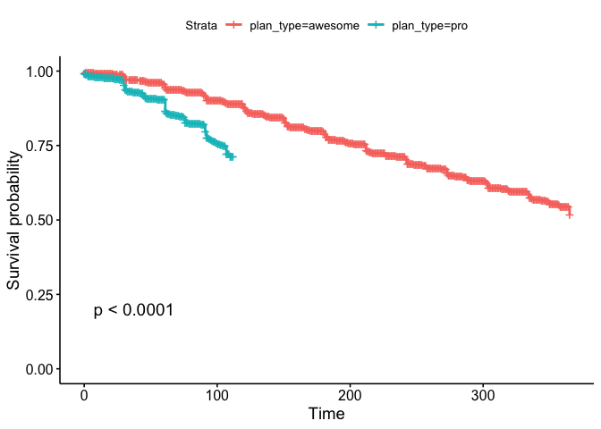
This plot is interesting. It suggests that users on the Pro plans are churning at a significantly higher rate than those on Awesome plans. Let’s compare the monthly plans only.
# filter out yearly subscriptions
monthly <- pro_subs %>%
  filter(billing_interval == 'month')

# fit survival data using the Kaplan-Meier method
surv_object2 <- Surv(time = monthly$length, event = monthly$churned)

# fit curve
fit2 <- survfit(surv_object2 ~ plan_id, data = monthly)

# plot survival curve
ggsurvplot(fit2, data = monthly, pval = TRUE)
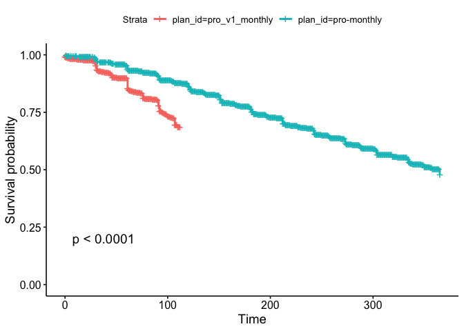
The trend is the same for monthly plans. Let’s calculate the percentage of subscriptions that are canceled within 32 days of the subscription start date.
# get churn rate
pro_subs %>%
  filter(!is.na(plan_type) & created_at < (Sys.Date() - 32)) %>%
  mutate(churned_in_range = churned & length <= 32) %>%
  group_by(plan_type, churned_in_range) %>%
  summarise(subscriptions = n_distinct(id)) %>%
  mutate(percent = subscriptions / sum(subscriptions)) %>%
  filter(churned_in_range)
## # A tibble: 2 x 4
## # Groups:   plan_type [2]
##   plan_type churned_in_range subscriptions percent
##   <chr>     <lgl>                    <int>   <dbl>
## 1 awesome   T                         3219  0.0867
## 2 pro       T                          715  0.0909
Indeed, it looks like around 9.1% of Pro subscriptions have churned within the first month or so. This is higher than the 8.7% of Awesome subscriptions that churned in 32 days or less. This will be an important metric to keep an eye on.